World Map
The data for plotting the World map comes from the maps (Brownrigg, 2014) package. We load the vector data for plotting a world map using map_data().
ds <- map_data("world")
head(ds)
## long lat group order region subregion
## 1 -69.89912 12.45200 1 1 Aruba <NA>
## 2 -69.89571 12.42300 1 2 Aruba <NA>
## 3 -69.94219 12.43853 1 3 Aruba <NA>
## 4 -70.00415 12.50049 1 4 Aruba <NA>
## 5 -70.06612 12.54697 1 5 Aruba <NA>
## 6 -70.05088 12.59707 1 6 Aruba <NA>It is quite simple to plot the world map using ggplot2 (Wickham and Chang, 2014).
p <- ggplot(ds, aes(x=long, y=lat, group=group)) + geom_polygon()
p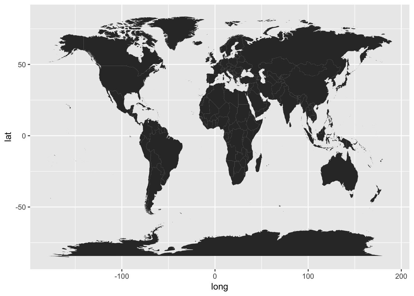
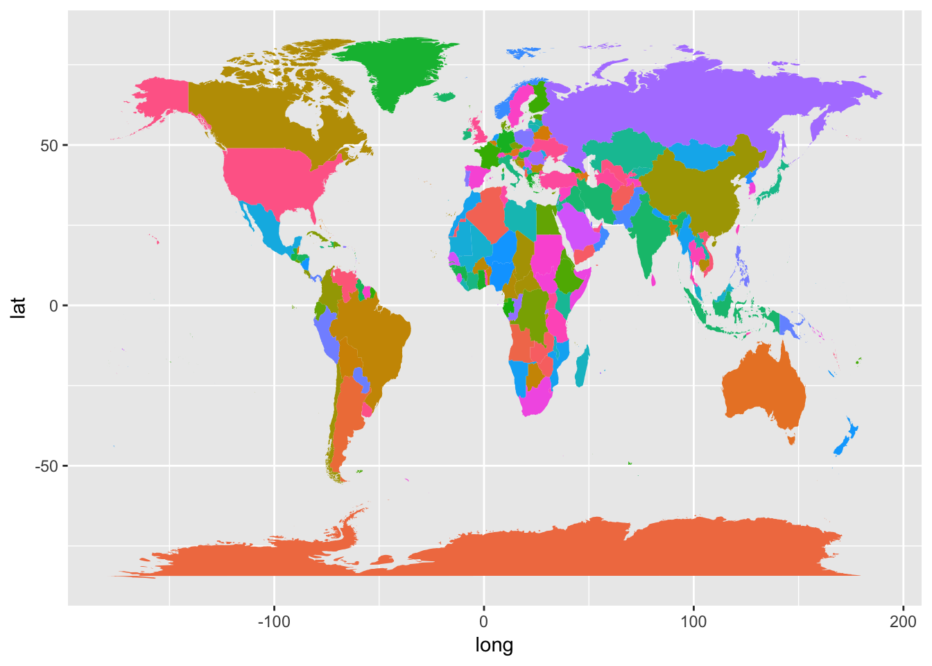
Let us add some colour based on regions. Now there are many regions, so for the same of aesthecity we will turn off the legend.
p  <-   ggplot(ds, aes(x=long, y=lat, group=group, fill=region)) +
        geom_polygon() +
        theme(legend.position="none")
p