Plotting Polygons and HeatMaps
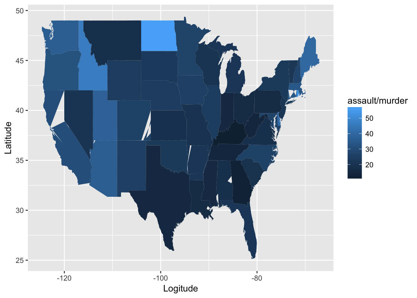
This example comes from the help page for map data() from ggplot2 (Wickham and Chang, 2014). It shows the number of assaults per murder in each US state, though it is quite easy to modify the code to display various statistics from the data. First we take a copy of the USArrests dataset and lowercase the variables and the state names to make the matching across di erent datasets uniform.
arrests <- USArrests
names(arrests) <- tolower(names(arrests))
arrests$region <- tolower(rownames(USArrests))
head(arrests)
## murder assault urbanpop rape region
## Alabama 13.2 236 58 21.2 alabama
## Alaska 10.0 263 48 44.5 alaska
## Arizona 8.1 294 80 31.0 arizona
## Arkansas 8.8 190 50 19.5 arkansas
## California 9.0 276 91 40.6 california
## Colorado 7.9 204 78 38.7 colorado## murder assault urbanpop rape region
## Alabama 13.2 236 58 21.2 alabama
## Alaska 10.0 263 48 44.5 alaska
## Arizona 8.1 294 80 31.0 arizonaThen we merge the statistics with the spatial data in readiness for mapping.
states <- map_data("state")
ds <- merge(states, arrests, sort=FALSE, by="region")
head(ds)
## region long lat group order subregion murder assault urbanpop
## 1 alabama -87.46201 30.38968 1 1 <NA> 13.2 236 58
## 2 alabama -87.48493 30.37249 1 2 <NA> 13.2 236 58
## 3 alabama -87.95475 30.24644 1 13 <NA> 13.2 236 58
## 4 alabama -88.00632 30.24071 1 14 <NA> 13.2 236 58
## 5 alabama -88.01778 30.25217 1 15 <NA> 13.2 236 58
## 6 alabama -87.52503 30.37249 1 3 <NA> 13.2 236 58
## rape
## 1 21.2
## 2 21.2
## 3 21.2
## 4 21.2
## 5 21.2
## 6 21.2Once we have the data ready, plotting it simply requires nominating the dataset, and identifying the x and y as long and lat respectively. We also need to identify the grouping, which is by state, and so the fill is then specified for each state to indicate the statistic of interest.
g <- ggplot(ds, aes(x=long, y=lat, group=group,
              fill=assault/murder)) + geom_polygon()
g + xlab('Logitude') + ylab('Latitude')